Overview
The graph components of your projects are where you can create multiple graphs for your data. A standard graph will allow you to create scatter plots, line charts, bar charts, histograms, bubble charts, pie charts, and polar area charts. You can even add regressions to your line and scatter plots! Multi graphs will allow you to combine multiple standard graphs on one graph. Finally if you just need some 1 var stats, you can easily generate them.
Graph
Each graph gives you the option to display a legend and change the axis lengths and will set the axis labels as the title of the data list you use. The standard graph gives you the multiple chart options to choose from (see overview). Below you can see some of the features each chart option provides.
Scatter Plot
For scatter plots, you can change the point color and size.
Line Chart
Line charts allow you to cusomize points as well as the line's size, color, and tension.
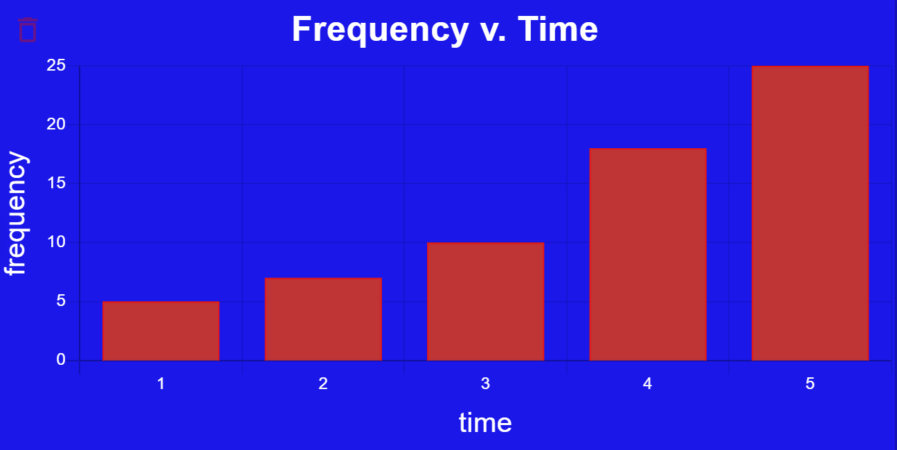
Histogram / Bar Graph
For both the histogram and bar graph, you can customize the bar background color, border color, and border width.
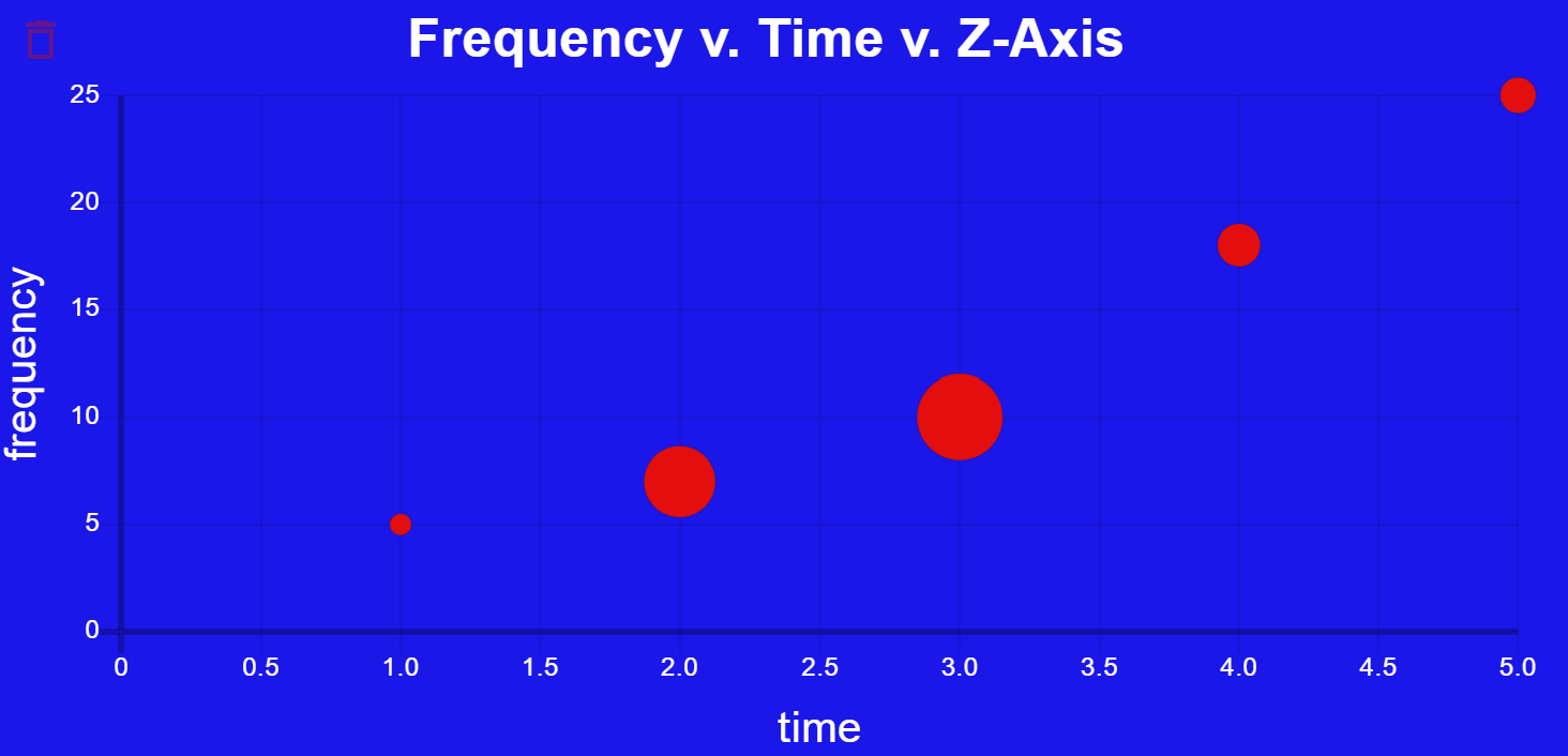
Bubble Chart
The Bubble Chart allows you to customize the point color and the max point radius.
Regression
You can add a regression to any scatter plot, line chart, or bubble chart that you create. The available regressions are linear, quadratic, cubic, quartic, natural log, exponential, and power. You can customize the regression line's color and width (and tension but that will not do anything...).
Multi-Graph
The Multi-graph allows you to combine two or more graphs using the same data. Multi-graphs do not currently support regressions but that may change in the future. Note that combining certain graphs together may lead to unexpected results...
1 Var Stats
1 Var Stats will find the mean, median, mode, min, Q1, Q3, max, population standard deviation, and sample standard deviation for any dataset you provide. If you need some 2 var stats, simply add another 1 var stats and you will likely have all the info you need.
Examples
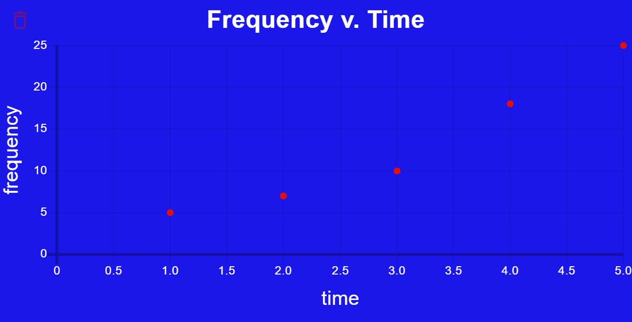
This is a scatter plot
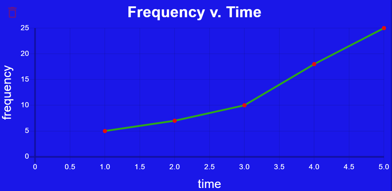
This is a line chart with 0 tension
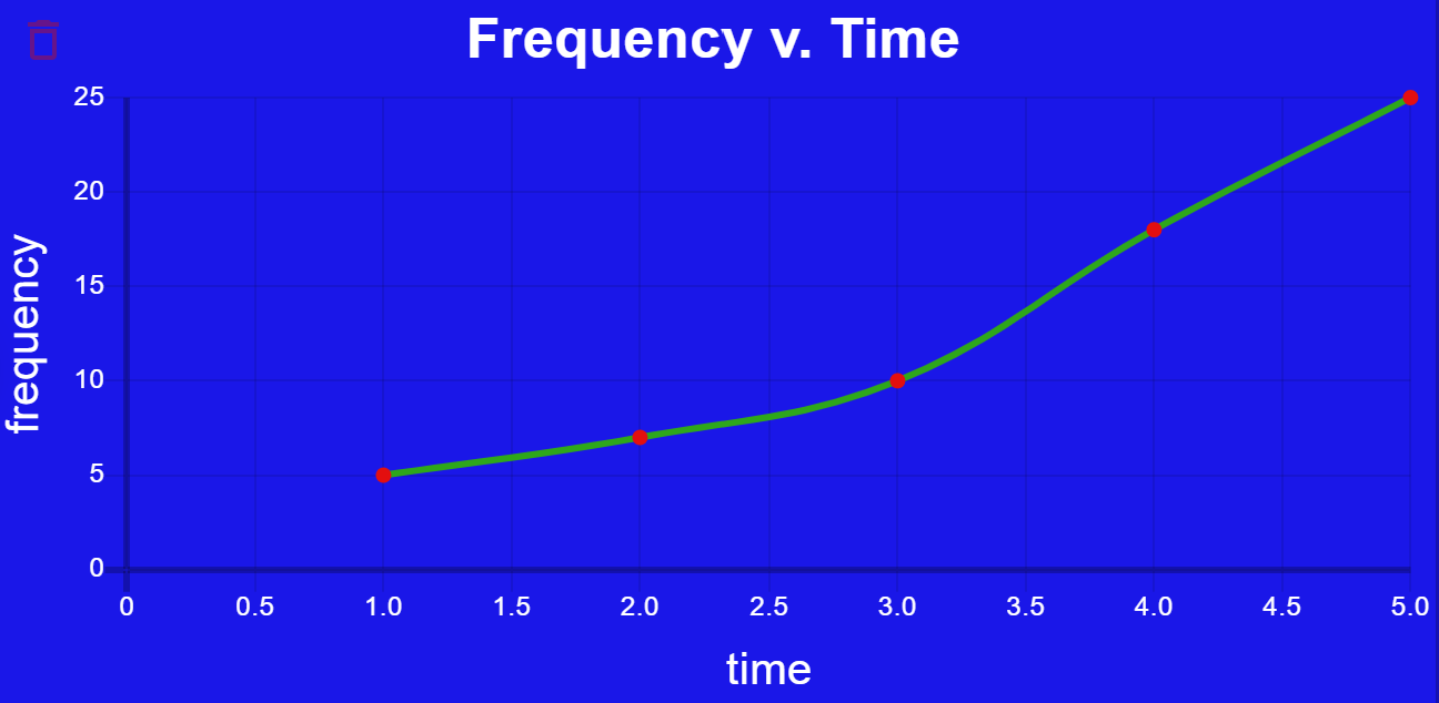
This is a line chart with 0.4 tension (default)
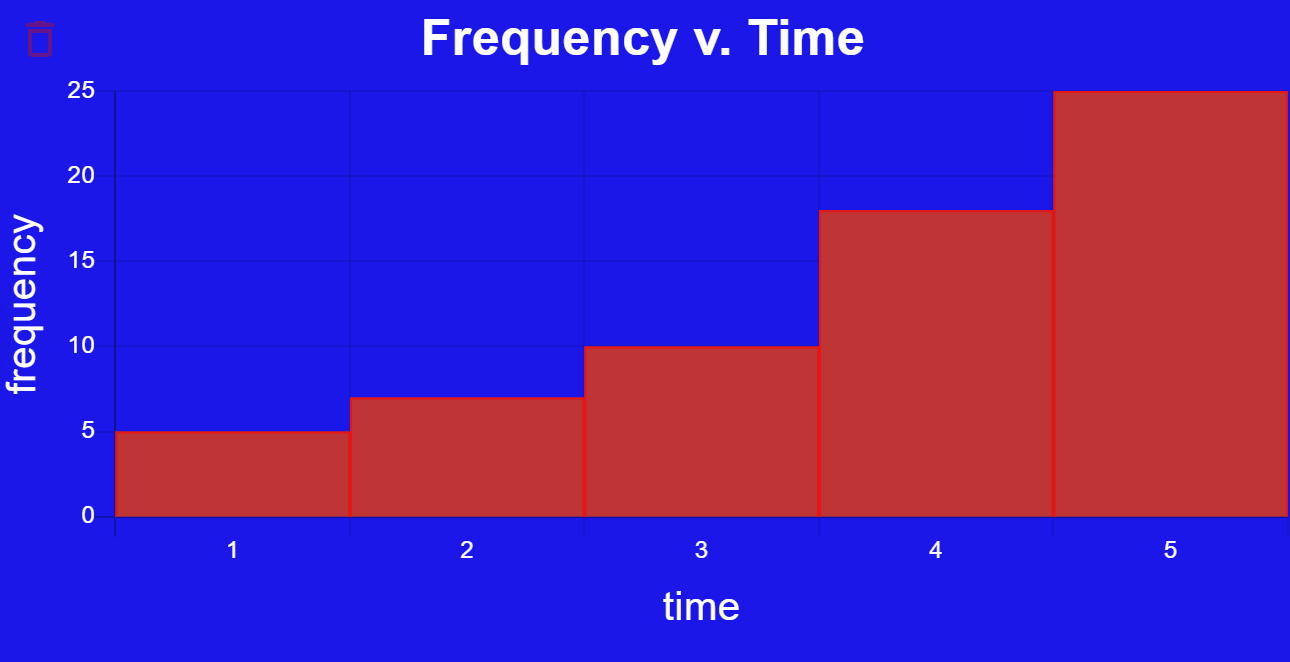
This is a histogram
This is a bar chart
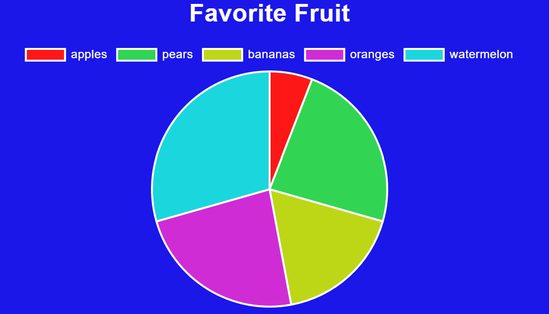
This is a pie chart
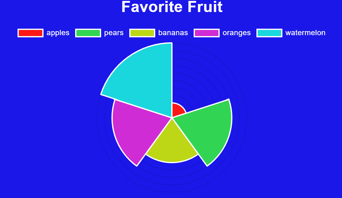
This is a polar area chart
This is a bubble chart (notice how a third dataset is used to determine each bubble's relative size)
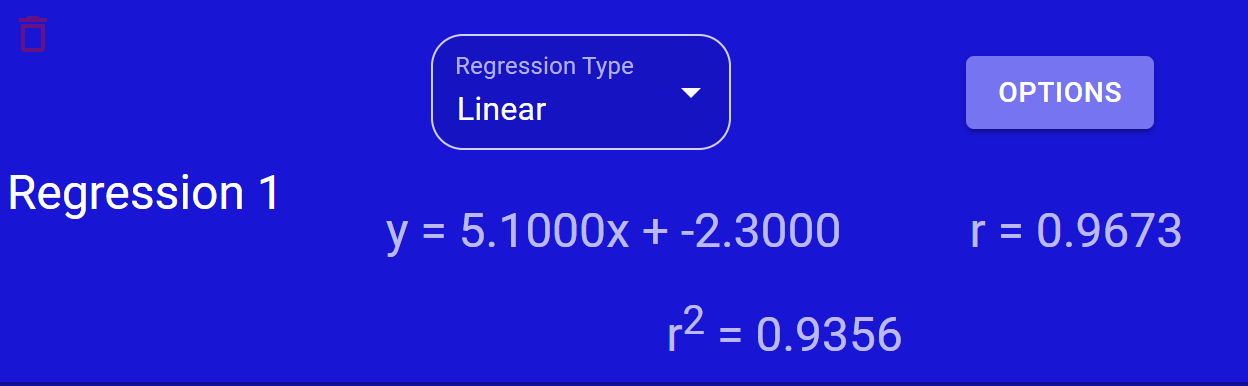
This is the output for a linear regression
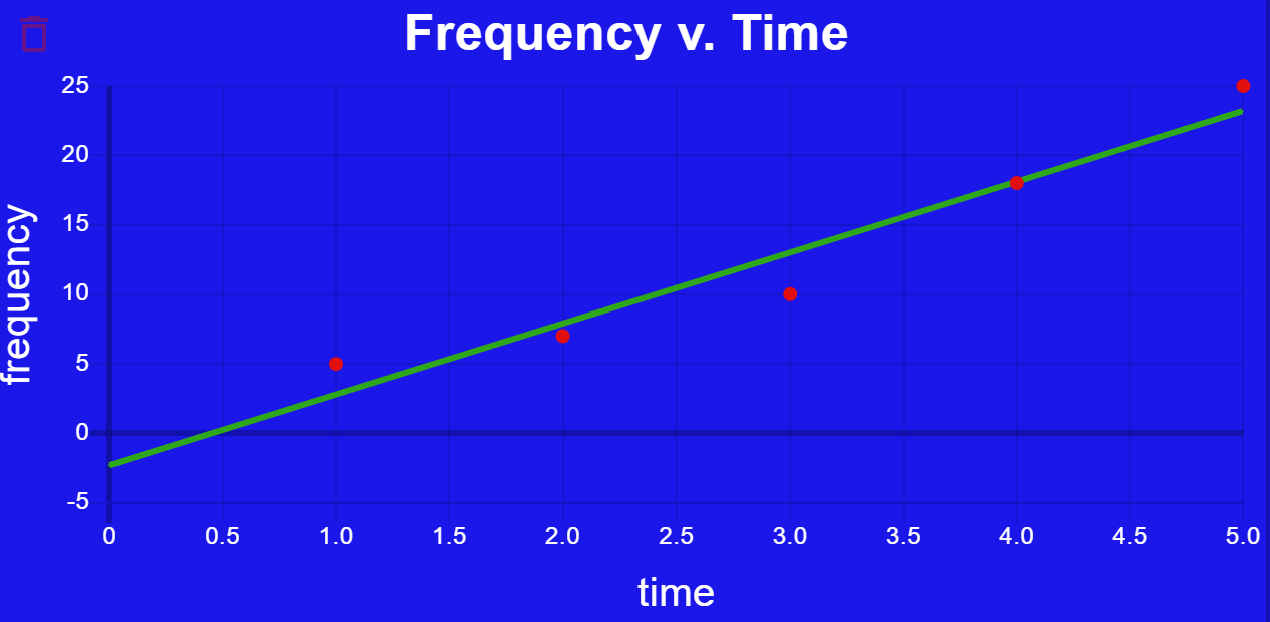
This is a linear regression graphed with a scatter plot